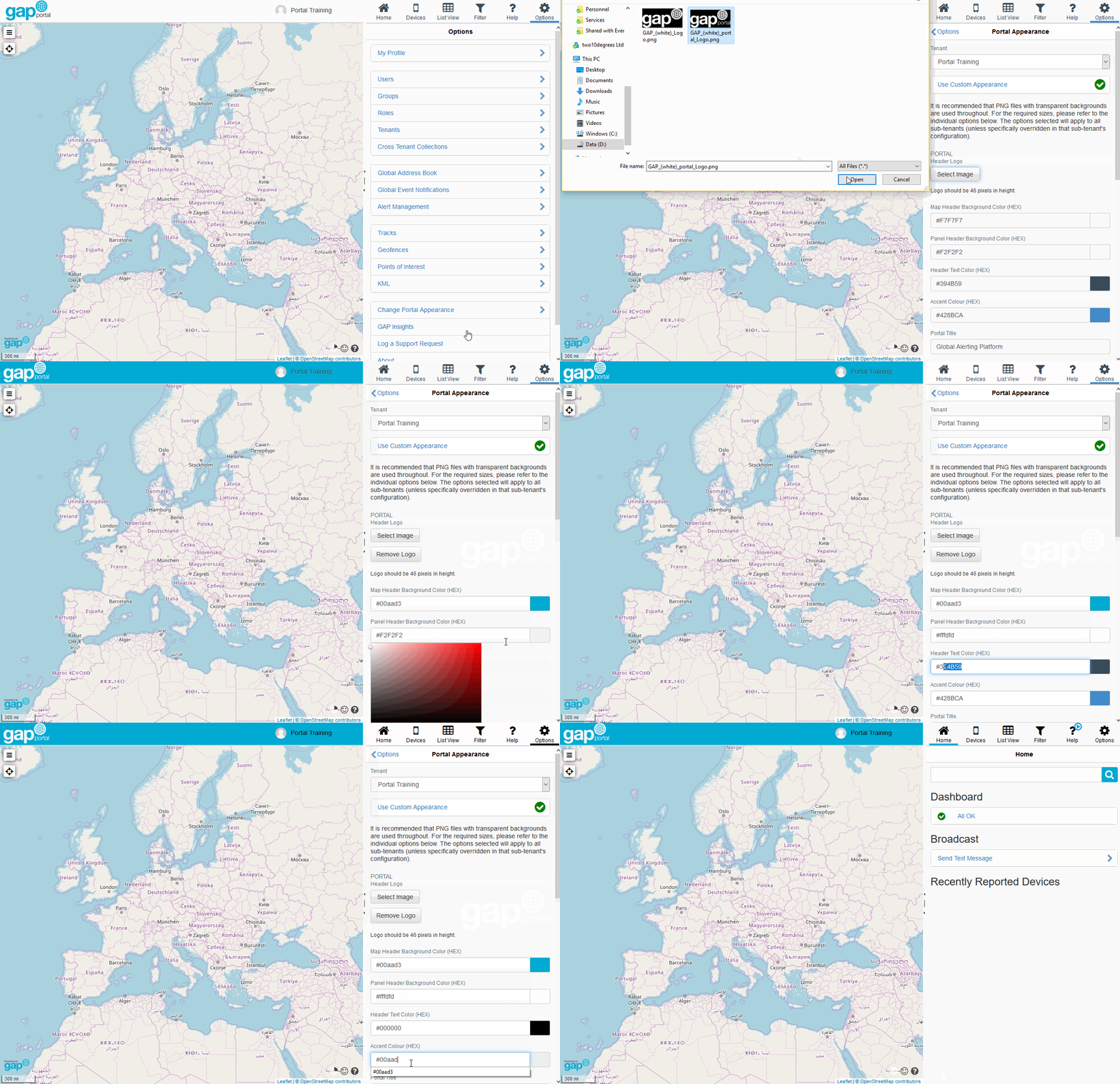
Customising Portal Appearance
You can customise many different aspects of the "look and feel" of the GAP Portal on a per-tenant basis. Options include:
Portal
- Map Header Background Colour (the background colour of the header above the map)
- Panel Header Background Colour (the background colour of the header above the right-hand side pane)
- Header Text Colour (the colour of the text and icons in the right-hand side banner menu - Home, Devices, List View, etc.)
- Accent Colour (the colour of buttons)
- Portal Title (the tab title shown in the browser)
- Favicon File (the icon used to represent the website when added to your favourites / bookmarks)

Portal Login Page
- Login Page Logo (the logo shown on the login page)
- Login Page Background Colour (the background colour of the login page)
Notification E-Mails
- Email Logo (the logo shown on event notification e-mails)
Insights
- Insights Logo (the logo shown on the Insights Portal)
- Insights Small Logo (the logo shown on the Insights Portal wehn the left-hand side navigation menu is collapsed)
- Insights Background Color (the background colour of the Insights Portal left-hand side navigation menu)
- Insights Menu Text Color (the colour of the text on the Insights Portal left-hand side navigation menu)